
React Styleguidist
React Styleguidist is a development tool that enables efficient component exploration, documentation, and collaboration for React applications.
 Tags
Tags
 Useful for
- 1.What is React Styleguidist?
- 2.Features
- 2.1.Development Environment
- 2.2.Style Guide
- 2.3.Example Style Guide
- 3.Use Cases
- 3.1.Component Libraries
- 3.2.Design Systems
- 3.3.Collaboration Between Developers and Designers
- 3.4.Rapid Prototyping
- 3.5.Onboarding New Team Members
- 4.Pricing
- 5.Comparison with Other Tools
- 5.1.Storybook
- 5.2.Styleguidist vs. Docz
- 5.3.Gatsby
- 6.FAQ
- 6.1.What are the main advantages of using React Styleguidist?
- 6.2.Is React Styleguidist suitable for large projects?
- 6.3.Can I use React Styleguidist with existing projects?
- 6.4.Does React Styleguidist support custom themes?
- 6.5.How does React Styleguidist handle accessibility?
What is React Styleguidist?
React Styleguidist is a development tool designed specifically for React components. It serves as a style guide generator that allows developers to create, document, and showcase their components in an interactive environment. With React Styleguidist, teams can focus on one component at a time, making it easier to visualize and test different variations and states of that component. This tool is particularly beneficial for teams working on large-scale applications where component reuse and documentation are critical for maintaining consistency and quality across the codebase.
Features
React Styleguidist boasts a variety of features that enhance the development process and improve collaboration among team members. Here are some of the key features:
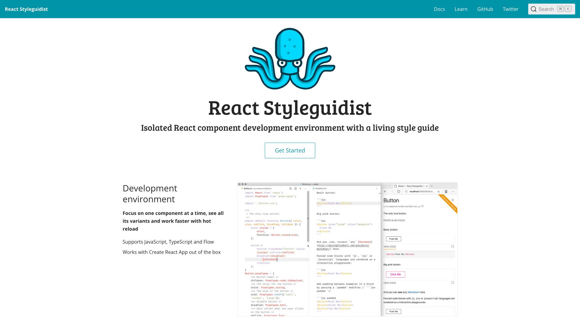
Development Environment
-
Component Focus: React Styleguidist allows developers to concentrate on one component at a time. This focused environment helps in understanding the component's functionality and design without the distractions of the entire application.
-
Hot Reloading: The tool supports hot reloading, enabling developers to see changes in real-time as they modify their components. This feature significantly speeds up the development process by eliminating the need for constant refreshes.
-
Support for Multiple Languages: React Styleguidist works seamlessly with JavaScript, TypeScript, and Flow, making it versatile for different coding preferences and project requirements.
-
Create React App Compatibility: The tool integrates effortlessly with Create React App, allowing developers to set up their style guide without additional configuration.
Style Guide
-
Team Collaboration: React Styleguidist facilitates collaboration among team members, including designers and developers. It serves as a central repository for all components, making it easier to share and review them.
-
Autogenerated Documentation: The tool automatically generates usage documentation for components based on their prop types and default values. This feature saves time and ensures that documentation is always up to date.
-
Editable Live Examples: Developers can create live examples of their components that can be edited directly within the style guide. This interactivity allows users to see how components behave with different props and data.
-
Interactive Playground: React Styleguidist includes an interactive playground where users can experiment with different combinations of props. This feature is particularly useful for finding the right configuration and understanding component behavior.
Example Style Guide
React Styleguidist provides example style guides to demonstrate its capabilities, including:
-
Dialog Components: Users can see how dialog components behave and can interact with them in real-time.
-
Everydayhero: This example showcases practical components used in everyday applications, providing insights into their implementation and usage.
-
Constructicon: A set of components that illustrate the construction of user interfaces using React.
-
Re-bulma: A collection of components styled with Bulma, demonstrating how to integrate third-party CSS frameworks with React components.
Use Cases
React Styleguidist is an invaluable tool for various use cases in the development lifecycle, including:
Component Libraries
For teams building component libraries, React Styleguidist serves as an essential tool for documenting and showcasing each component. It allows developers to create a cohesive library that can be easily consumed by other projects.
Design Systems
In the context of design systems, React Styleguidist helps maintain consistency across components by providing a centralized location for documentation. Designers can reference the style guide to ensure that components adhere to design specifications.
Collaboration Between Developers and Designers
React Styleguidist fosters collaboration between developers and designers by providing a shared space where both parties can review and discuss components. Designers can see how components behave in real-time, making it easier to provide feedback and make necessary adjustments.
Rapid Prototyping
Developers can use React Styleguidist for rapid prototyping of components. By creating live examples and testing different props, developers can quickly iterate on designs and functionality, leading to faster development cycles.
Onboarding New Team Members
For new team members, React Styleguidist serves as a valuable resource for understanding the component library and its usage. The autogenerated documentation and interactive examples make it easier for newcomers to get up to speed with the project.
Pricing
React Styleguidist is an open-source tool, which means it is free to use. However, while the tool itself does not have a pricing model, organizations may incur costs related to hosting the style guide or integrating it into their existing development workflow. Companies can also consider investing in additional tools or services that complement React Styleguidist to enhance their development process.
Comparison with Other Tools
When comparing React Styleguidist with other similar tools, several unique selling points and differences emerge:
Storybook
-
Focus: While both React Styleguidist and Storybook serve as style guide generators, Storybook is more focused on building UI components in isolation, allowing for a wider range of UI testing and development scenarios.
-
Add-ons: Storybook has a rich ecosystem of add-ons that enhance its functionality, such as accessibility testing and documentation generation. React Styleguidist, on the other hand, is more streamlined and focused on documentation and live examples.
Styleguidist vs. Docz
-
Simplicity: React Styleguidist offers a simpler setup and configuration compared to Docz, making it easier for developers to get started quickly.
-
Component-Centric: React Styleguidist is heavily focused on React components, while Docz supports multiple frameworks, which may be beneficial for teams working with diverse technologies.
Gatsby
-
Static Site Generation: Gatsby is a static site generator that can be used to create documentation sites for React components. However, it requires more setup and configuration compared to React Styleguidist, which is specifically tailored for component documentation.
-
Performance: Gatsby is known for its performance and optimization features, making it great for large documentation sites. React Styleguidist, while efficient, is primarily focused on the development and documentation of components rather than performance optimization.
FAQ
What are the main advantages of using React Styleguidist?
React Styleguidist simplifies the process of developing and documenting React components. Its main advantages include a focused development environment, hot reloading, autogenerated documentation, and interactive examples that enhance collaboration among team members.
Is React Styleguidist suitable for large projects?
Yes, React Styleguidist is well-suited for large projects where multiple components are developed and reused. Its centralized documentation and interactive features make it easier to manage and maintain a large component library.
Can I use React Styleguidist with existing projects?
Absolutely! React Styleguidist can be integrated into existing React projects with minimal configuration. It works well with Create React App and can be easily adapted to fit your current workflow.
Does React Styleguidist support custom themes?
Yes, React Styleguidist allows users to customize the look and feel of their style guide using custom themes. This feature enables teams to align the style guide with their branding and design guidelines.
How does React Styleguidist handle accessibility?
React Styleguidist provides a platform for developers to create accessible components by allowing them to test and demonstrate accessibility features within the interactive playground. However, it is up to the developers to ensure that their components meet accessibility standards.
In summary, React Styleguidist is a powerful tool for developing, documenting, and sharing React components. Its focus on interactivity, simplicity, and collaboration makes it an essential asset for teams looking to streamline their development process and enhance component reuse across projects.
Ready to try it out?
Go to React Styleguidist