
Columns
Columns is a visualization tool that transforms text into graphs effortlessly, eliminating the need for data analysis.


 Tags
Tags
 Useful for
- 1.What is Columns?
- 2.Features
- 2.1.1. Text to Graph Conversion
- 2.2.2. User-Friendly Interface
- 2.3.3. Customization Options
- 2.4.4. Gallery of Visualizations
- 2.5.5. API Integration
- 2.6.6. Data Sheet Management
- 2.7.7. Social Sharing Options
- 2.8.8. No Sorting Required
- 3.Use Cases
- 3.1.1. Educational Purposes
- 3.2.2. Business Presentations
- 3.3.3. Marketing Analytics
- 3.4.4. Research and Data Analysis
- 3.5.5. Social Media Engagement
- 4.Pricing
- 5.Comparison with Other Tools
- 5.1.1. Simplified Text to Graph Process
- 5.2.2. User-Friendly Design
- 5.3.3. Quick Visualization Creation
- 5.4.4. Customization and Flexibility
- 5.5.5. Integration Capabilities
- 6.FAQ
- 6.1.1. What types of visualizations can I create with Columns?
- 6.2.2. Do I need any prior experience to use Columns?
- 6.3.3. Can I share my visualizations on social media?
- 6.4.4. Is there a mobile version of Columns?
- 6.5.5. How can I integrate Columns into my existing system?
- 6.6.6. Is there a free trial available?
- 6.7.7. Can I customize the appearance of my visualizations?
What is Columns?
Columns is an innovative tool designed to transform textual data into visual representations without the need for extensive data analysis. It simplifies the process of creating graphs and charts from plain text, making it accessible for users who may not have a background in data science or analytics. The tool is particularly useful for individuals and organizations looking to visualize information quickly and effectively, without the complexities often associated with traditional data analysis software.
Features
Columns comes equipped with a range of features that enhance its usability and effectiveness:
1. Text to Graph Conversion
The core functionality of Columns is its ability to convert text into visual data representations. Users can input plain text, and the tool will automatically interpret and transform it into various types of graphs, including bar charts, line graphs, and pie charts. This feature eliminates the need for manual data entry and formatting, saving users time and effort.
2. User-Friendly Interface
Columns boasts an intuitive interface that allows users to navigate the tool with ease. The layout is clean and straightforward, enabling users to focus on their data without being overwhelmed by complex options or settings. This user-centric design is especially beneficial for those who may be new to data visualization.
3. Customization Options
Users can customize their visualizations to better suit their needs. Columns offers various customization options, including colors, fonts, and layout styles. This flexibility allows users to create visuals that align with their branding or personal preferences, enhancing the overall presentation of the data.
4. Gallery of Visualizations
Columns features a gallery that showcases different types of visualizations created using the tool. This gallery serves as inspiration for users, helping them understand the potential of their data and how it can be represented visually. It also provides examples of effective data visualization practices.
5. API Integration
For developers and organizations looking to integrate Columns into their existing systems, the tool offers an API. This feature allows for seamless integration of text-to-graph functionality into websites, applications, or other platforms, making it a versatile option for businesses.
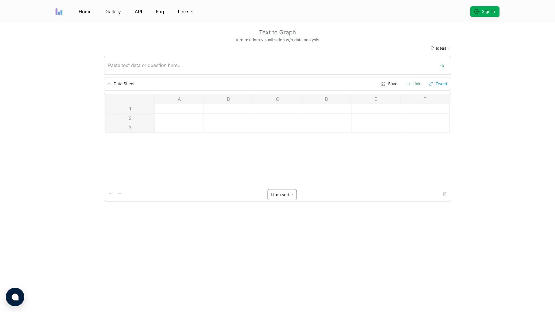
6. Data Sheet Management
Columns provides a data sheet management feature that allows users to save and organize their visualizations. Users can easily access their previous work, making it convenient to revisit and modify existing graphs or charts as needed.
7. Social Sharing Options
The tool includes social sharing options, enabling users to share their visualizations on social media platforms. This feature is particularly useful for individuals and businesses looking to promote their data insights or findings to a broader audience.
8. No Sorting Required
Columns eliminates the need for sorting data manually. Users can input their text directly, and the tool will handle the organization and formatting, allowing for a more streamlined workflow.
Use Cases
Columns is a versatile tool that can be applied across various industries and use cases. Here are some examples:
1. Educational Purposes
Educators can use Columns to create visual aids for their lessons. By converting textual information into graphs, teachers can help students better understand complex concepts and data relationships, making learning more engaging and effective.
2. Business Presentations
Business professionals can leverage Columns to visualize data for presentations, reports, or meetings. The ability to create compelling graphs quickly allows teams to communicate insights and findings more effectively, facilitating better decision-making.
3. Marketing Analytics
Marketing teams can utilize Columns to visualize campaign performance metrics, customer demographics, and market trends. By presenting data in a visually appealing manner, marketers can drive home their points and engage stakeholders more effectively.
4. Research and Data Analysis
Researchers can benefit from Columns by using it to visualize their findings. Whether it's academic research or market research, the tool can help present complex data in a more digestible format, making it easier to communicate results to peers or the public.
5. Social Media Engagement
Content creators and social media managers can use Columns to generate eye-catching visuals for their posts. By transforming textual data into graphs, they can enhance their content and attract more engagement from their audience.
Pricing
While specific pricing details for Columns were not provided in the initial content, it is essential to consider the value it offers in relation to its cost. Pricing models for tools like Columns often include:
- Free Tier: A basic version with limited features, suitable for casual users or those looking to try the tool before committing to a paid plan.
- Subscription Plans: Monthly or annual subscription options that unlock additional features, customization options, and higher usage limits.
- Enterprise Solutions: Tailored packages for organizations that require advanced functionality, API access, and dedicated support.
Users interested in Columns should evaluate their needs and explore the pricing structure that best fits their requirements.
Comparison with Other Tools
When comparing Columns with other data visualization tools, several unique selling points stand out:
1. Simplified Text to Graph Process
Unlike many traditional data visualization tools that require users to input data in structured formats (like spreadsheets), Columns focuses on converting plain text into visualizations directly. This approach streamlines the process for users who may not have extensive data formatting skills.
2. User-Friendly Design
Columns prioritizes user experience with its intuitive interface, making it accessible for users of all skill levels. In contrast, many other tools can be overwhelming for beginners due to their complex functionalities and steep learning curves.
3. Quick Visualization Creation
The ability to generate visualizations rapidly sets Columns apart from competitors. Users can quickly input text and receive visual outputs without the need for extensive data manipulation or analysis, making it a time-efficient solution.
4. Customization and Flexibility
Columns offers a range of customization options that allow users to tailor their visualizations to match their branding or preferences. While other tools may provide customization features, Columns focuses on making this process straightforward and accessible.
5. Integration Capabilities
The API integration feature of Columns allows businesses to incorporate its functionality into their existing systems seamlessly. This versatility can be a significant advantage for organizations looking to enhance their data visualization capabilities without overhauling their current processes.
FAQ
1. What types of visualizations can I create with Columns?
Columns supports a variety of visualization types, including bar charts, line graphs, and pie charts. Users can choose the format that best represents their data.
2. Do I need any prior experience to use Columns?
No, Columns is designed to be user-friendly and accessible for individuals with no prior experience in data visualization. The intuitive interface guides users through the process of creating visualizations.
3. Can I share my visualizations on social media?
Yes, Columns includes social sharing options that allow users to easily share their visualizations on various social media platforms.
4. Is there a mobile version of Columns?
The initial content does not specify whether Columns has a mobile version. Users interested in mobile accessibility should check the official website or contact customer support for more information.
5. How can I integrate Columns into my existing system?
Columns offers an API that allows developers to integrate its text-to-graph functionality into their websites, applications, or other platforms. This feature provides flexibility for organizations looking to enhance their data visualization capabilities.
6. Is there a free trial available?
The content does not specify details about a free trial. Users should explore the official website for information regarding trial options or free tiers.
7. Can I customize the appearance of my visualizations?
Yes, Columns provides several customization options, allowing users to modify colors, fonts, and layout styles to create visuals that align with their preferences.
In conclusion, Columns is a powerful tool that simplifies the process of transforming text into visual data representations. With its user-friendly interface, customization options, and quick visualization capabilities, it caters to a wide range of users from educators to business professionals. Whether you're looking to enhance presentations, engage audiences, or simplify data analysis, Columns offers a compelling solution for your data visualization needs.
Ready to try it out?
Go to Columns