
ChartGPT
ChartGPT simplifies data visualization by allowing users to create and customize various chart types with ease.
 Tags
Tags
 Useful for
- 1.What is ChartGPT?
- 2.Features
- 2.1.1. Diverse Chart Types
- 2.2.2. Customization Options
- 2.3.3. User-Friendly Interface
- 2.3.1.4. Interactive Features
- 2.4.5. Idea Suggestions
- 3.Use Cases
- 3.1.1. Business Analytics
- 3.2.2. Education
- 3.3.3. Research
- 3.4.4. Marketing
- 3.5.5. Personal Projects
- 4.Pricing
- 5.Comparison with Other Tools
- 5.1.1. Ease of Use
- 5.2.2. Variety of Chart Types
- 5.3.3. Customization Flexibility
- 6.4. Interactive Features
- 6.1.5. Idea Generation
- 7.FAQ
- 7.1.Q1: Is ChartGPT suitable for beginners?
- 7.2.Q2: Can I export my charts from ChartGPT?
- 7.3.Q3: Does ChartGPT support real-time data visualization?
- 7.4.Q4: Are there any limitations on the number of charts I can create?
- 7.5.Q5: Can I collaborate with others on ChartGPT?
- 7.6.Q6: Is there customer support available for ChartGPT users?
- 7.7.Q7: Can I use ChartGPT for professional presentations?
What is ChartGPT?
ChartGPT is an innovative data visualization tool designed to simplify the process of creating a variety of charts and graphs. With an intuitive interface and a range of customizable options, ChartGPT allows users to transform raw data into visually appealing and informative representations. Whether you are a business analyst, educator, researcher, or simply someone who wants to present data clearly, ChartGPT caters to your needs by providing a user-friendly platform for visualizing data.
Features
ChartGPT boasts a range of features that enhance the user experience and make data visualization accessible to everyone, regardless of their technical expertise. Here are some of the key features:
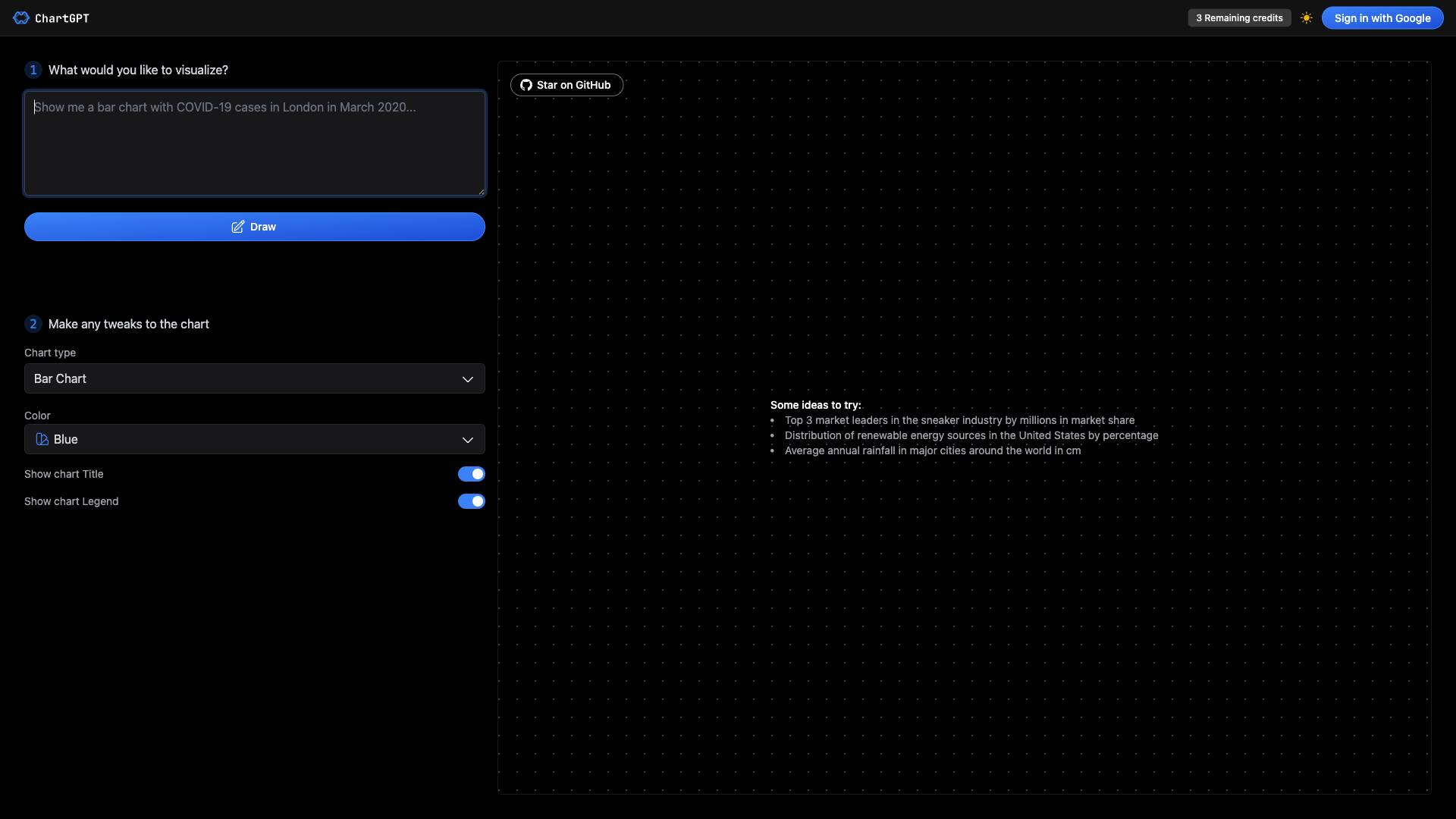
1. Diverse Chart Types
ChartGPT supports multiple chart types, enabling users to select the most appropriate format for their data. The available chart types include:
- Bar Chart: Ideal for comparing quantities across different categories.
- Area Chart: Useful for showing cumulative totals over time.
- Line Chart: Best suited for displaying trends over a continuous interval.
- Composed Chart: Allows for the combination of multiple chart types in a single visualization.
- Pie Chart: Effective for illustrating proportions and percentages.
- Scatter Chart: Great for showing relationships between two variables.
- Radar Chart: Useful for displaying multivariate data in a two-dimensional graph.
- Radial Bar Chart: A circular representation of data that showcases values in a visually appealing manner.
- Treemap: Displays hierarchical data as a set of nested rectangles.
- Funnel Chart: Used to visualize stages in a process and the conversion rates between them.
2. Customization Options
Users can tailor their charts to fit their personal or organizational branding by customizing various aspects of the visualizations. Key customization options include:
- Color Schemes: Choose from a variety of color palettes (e.g., Blue, Purple, Green, Pink, Yellow) to match the theme of your presentation or report.
- Chart Titles: Add descriptive titles to your charts to provide context and clarity.
- Legends: Include legends to help viewers understand the data represented in the chart.
3. User-Friendly Interface
ChartGPT features a simple and intuitive interface that allows users to create charts with minimal effort. The drag-and-drop functionality and clear navigation make it easy to input data, select chart types, and customize visualizations.
4. Interactive Features
Users can make real-time tweaks to their charts, allowing for immediate feedback and adjustments. This interactivity enhances the overall user experience and ensures that the final product meets the user's expectations.
5. Idea Suggestions
ChartGPT provides users with sample ideas to inspire their visualizations. For instance, users can explore:
- Top 3 market leaders in the sneaker industry by millions in market share.
- Distribution of renewable energy sources in the United States by percentage.
- Average annual rainfall in major cities around the world in centimeters.
These suggestions help users understand what types of data can be effectively visualized and spark creativity in their projects.
Use Cases
ChartGPT is versatile and can be utilized in various scenarios across different fields. Here are some common use cases:
1. Business Analytics
Businesses can leverage ChartGPT to visualize key performance indicators (KPIs), sales data, and market trends. By creating engaging charts, teams can effectively communicate insights to stakeholders and make data-driven decisions.
2. Education
Educators can use ChartGPT to create visual aids for lessons, helping students grasp complex concepts more easily. Charts can be used to illustrate statistical data, historical trends, or scientific findings, enhancing the learning experience.
3. Research
Researchers can visually present their findings in reports and publications. By using charts to summarize data, they can make their research more accessible and compelling to a broader audience.
4. Marketing
Marketing professionals can visualize campaign performance metrics, customer demographics, and market research data. This visualization helps in crafting targeted strategies and presenting results to clients or management.
5. Personal Projects
Individuals can use ChartGPT for personal projects, such as tracking fitness progress, budgeting, or analyzing hobby-related data. The tool's user-friendly interface makes it easy for anyone to create charts that help visualize their personal goals and achievements.
Pricing
While specific pricing details are not provided in the content, it is essential to consider the potential pricing structure that ChartGPT may adopt. Typically, data visualization tools offer a range of pricing plans, which may include:
- Free Tier: A limited version of the tool with basic features, suitable for casual users or those who want to try the platform.
- Subscription Plans: Monthly or annual subscriptions that unlock advanced features, additional chart types, and enhanced customization options.
- Enterprise Solutions: Tailored packages for businesses or organizations that require extensive data visualization capabilities and collaboration features.
Users should evaluate their needs and budget to choose the most appropriate plan.
Comparison with Other Tools
When comparing ChartGPT with other data visualization tools on the market, several unique selling points stand out:
1. Ease of Use
ChartGPT is designed with a focus on user-friendliness, making it accessible to users with varying levels of technical expertise. Many competing tools may have steeper learning curves or require advanced knowledge in data science.
2. Variety of Chart Types
While many visualization tools offer a limited selection of chart types, ChartGPT provides an extensive range of formats, catering to diverse data visualization needs. This versatility allows users to choose the most effective representation for their data.
3. Customization Flexibility
ChartGPT's customization options enable users to create personalized visualizations that align with their branding or presentation style. Some other tools may offer limited customization, which can hinder the ability to create visually appealing charts.
4. Interactive Features
The ability to make real-time adjustments to charts sets ChartGPT apart from many static visualization tools. This interactivity enhances user engagement and allows for a more dynamic visualization process.
5. Idea Generation
ChartGPT's feature of providing suggestions for data visualization ideas is a valuable addition that can inspire users and help them think creatively about their data.
FAQ
Q1: Is ChartGPT suitable for beginners?
Yes, ChartGPT is designed with a user-friendly interface that makes it accessible to beginners and those with limited technical skills. The intuitive drag-and-drop functionality simplifies the chart creation process.
Q2: Can I export my charts from ChartGPT?
While the content does not specify export options, most data visualization tools typically allow users to export charts in various formats (e.g., PNG, JPEG, PDF). Users should check the platform for specific export capabilities.
Q3: Does ChartGPT support real-time data visualization?
The content does not explicitly mention real-time data capabilities. Users interested in real-time visualization should explore the tool's features or inquire about this functionality.
Q4: Are there any limitations on the number of charts I can create?
The content indicates that users have a limited number of credits (e.g., "3 Remaining credits"), suggesting that there may be restrictions on the number of charts created within a specific timeframe or plan. Users should review the pricing plan details for clarification.
Q5: Can I collaborate with others on ChartGPT?
The content does not mention collaboration features. Users looking for collaborative capabilities should verify whether ChartGPT supports team collaboration and sharing options.
Q6: Is there customer support available for ChartGPT users?
While the content does not specify customer support options, reputable tools typically offer customer support through various channels (e.g., email, chat, or forums). Users should check the website for support resources.
Q7: Can I use ChartGPT for professional presentations?
Absolutely! ChartGPT allows users to create polished and professional charts that are suitable for presentations, reports, and other professional settings.
In conclusion, ChartGPT is a powerful yet user-friendly tool for data visualization that caters to a wide range of users and use cases. With its diverse chart types, customization options, and interactive features, it stands out as an excellent choice for anyone looking to visualize data effectively.
Ready to try it out?
Go to ChartGPT